Card-based design has become one of the most popular UI patterns across the web and for good reason.
From mobile apps and dashboards to news websites and online stores, cards offer a flexible and clean way to organize content that’s easy to browse, understand, and interact with.
These modular blocks of content make it simple to display images, text, buttons, and links in a way that feels intuitive and responsive across all screen sizes.
But beyond just looking neat, card-based layouts play a big role in shaping how users experience and interact with digital products.
In this post, we’ll explore why card-based layouts work so well, how they influence user experience, and how to design cards that make content more usable and engaging.
What Is a Card-Based Layout?
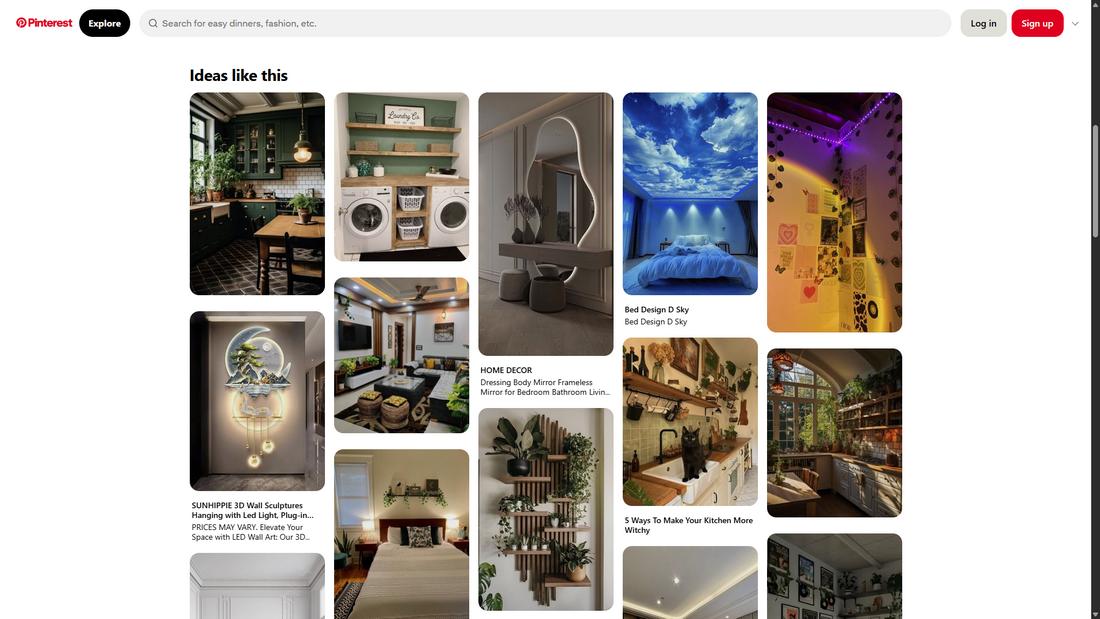
A card-based layout is a user interface design approach where content is grouped into rectangular or square containers, often called “cards.”
Each card design typically contains a small chunk of information, such as a headline, image, brief description, and sometimes a call-to-action button.
These cards can act as previews, links, or standalone content blocks that users can interact with.
This layout style is inspired by physical index cards or playing cards, where each piece of content stands on its own but is part of a larger collection.
Card-based layouts are especially popular in digital design because they offer structure, flexibility, and a highly scannable format that works well across all devices.
Whether it’s for web design, news articles, product listings, or dashboards, cards make it easy to digest and navigate content in a clean, consistent way.
Why Card Layouts Work So Well
Cards are easy for users to recognize and scan because they group related content together in visually distinct containers.
This structure mirrors how people naturally organize information into chunks and gives users the freedom to browse at their own pace.
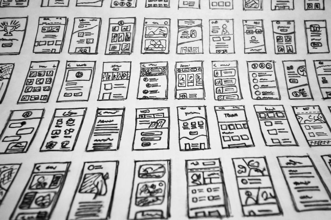
They also adapt beautifully to responsive design. Whether you’re viewing a page on a large desktop or a small smartphone screen, cards stack and rearrange themselves to fit the layout without losing clarity or functionality.
Cards are highly modular, which makes them perfect for scaling content-heavy designs.
Designers and developers can build consistent UI systems where new content can be added quickly without disrupting the overall layout.
The UX Benefits of Card-Based Design

Card layouts support strong UX by improving how people find and engage with content.
Each card acts as a mini decision point as it holds just enough information to spark interest without overwhelming the user. This keeps the browsing experience light and fast.
Cards also encourage exploration. Whether it’s an article summary, product preview, or video thumbnail, users can quickly skim through content and dive deeper into what interests them.
The uniform structure helps reduce cognitive load by making information predictable and scannable.
And because each card can contain its own interactive elements like buttons or hover effects, users can interact with specific content directly from the card, making it easier to engage with features and take action.
Post a Comment